Problem:
If a person tries to use the keyboard to access links, buttons or options in the menu, it is not visually possible to know which element the focus is on.
Solution
This flaw can, in most parts, be corrected with CSS code.
Note: It may be that even if you add the code, other elements DO NOT visually show if it is in focus. It will have to be corrected by adding another code for that exception.
Procedure for Theme The7 users:
-
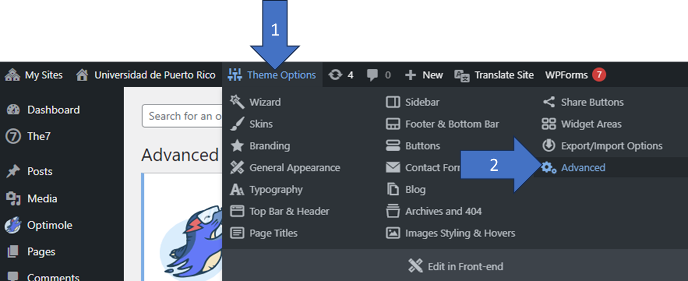
- In the admin area of your page go to the top menu and look for “Theme Options” → “Advanced”
- Click on the “Tab” that says “Custom CSS” (arrow 3)
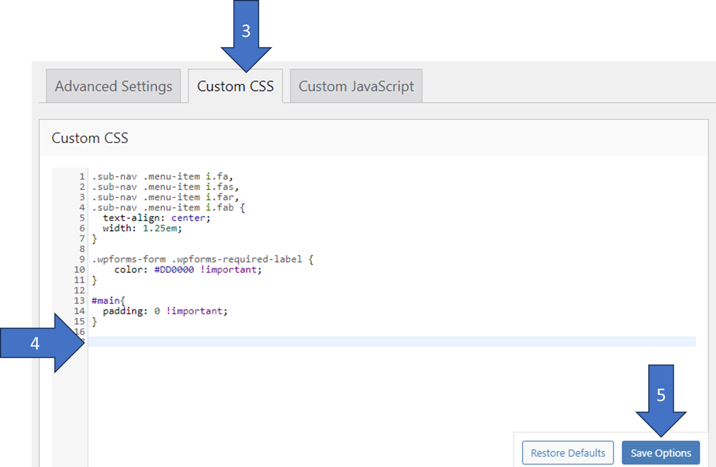
- In the space provided, add the following code (you can change the color #f28c20 to whatever suits you best, depending on your page): (arrow 4)
[code language=»css»]a:focus{ border: 3px solid #f28c20; display:inline-block; }[/code]
- At the end, hit the “Save Options” button at the bottom bottom to save the changes (arrow 5)
- Go to your frontend page in your browser. I recommend that you open a new screen in "incognito" mode, so that "administrator" options (that black strip menu on your page) do not appear. Try using the "Tab" and see if the items in focus are "checked".
- In the admin area of your page go to the top menu and look for “Theme Options” → “Advanced”
Problem:
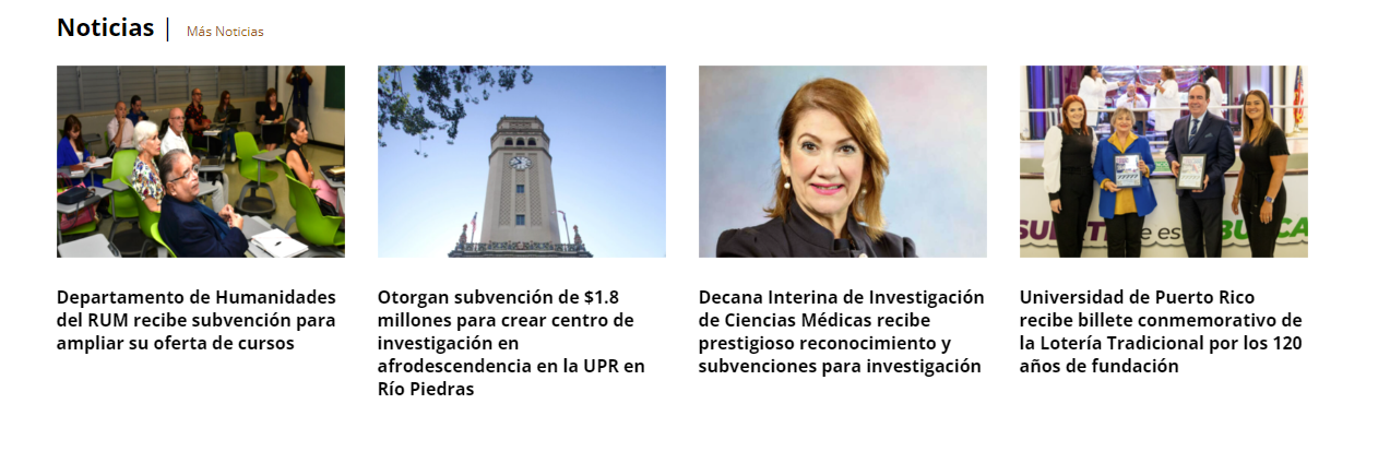
The «Blog Masonry and Grid» element displays a list of «posts» (usually news) consisting of an image, a title, author date (optional), and a summary of the news (optional). Generally, the user with the mouse can select the news that he wants to read and clicks on the image or the title. Since both elements have a separate link, when we use the keyboard to navigate there will be 2 consecutive selections that will have focus: The photo, and then the news title. This title, if it has more than one line, then the focus frame may look bad. Having two spotlights for the same link may not be a mistake, but I made the decision to simplify the "user experience" by putting a single spotlight for each news link.
Image from the “Masonry and Grid Blog”:
Solution
En esta ocación hay que usar una combinación de JavaScript y CSS. Javascript se utiliza para evitar que la imagen de la noticia obtenga el foco (simplificando la experiencia a un enlace por noticia). Mientra que el CSS se encarga de arreglar visualmente como luce el «foco» del elemento del titulo. En lugar de usar el elemento de enlace <a> que comprende el título, vamos a enmarcar el elemento <h3> del título para que cuando se active el foco al rededor del mismo, luzca mejor.
Procedures for Theme The7 users
Adding the Javascript to remove the focus from the image:
- Activate the “Header and Footer Scripts” plugin – This plugin ensures that if I put code in the “Footer” I will be able to access all the elements of the page. (if I use “Header” – the program is executed before the page is generated and the elements will not be accessible).

- After activating this plugin you have to go to the administration menu (on the left) as follows:
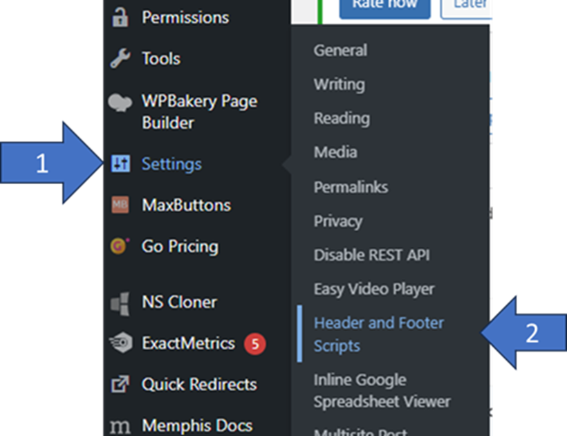
- On the screen that is presented to us, we look for the “Scripts in footer” section. In the area provided, we must write the code. – Remember to write “” at the end. If you already have code in this section, put a space between to insert the new code without deleting the old.
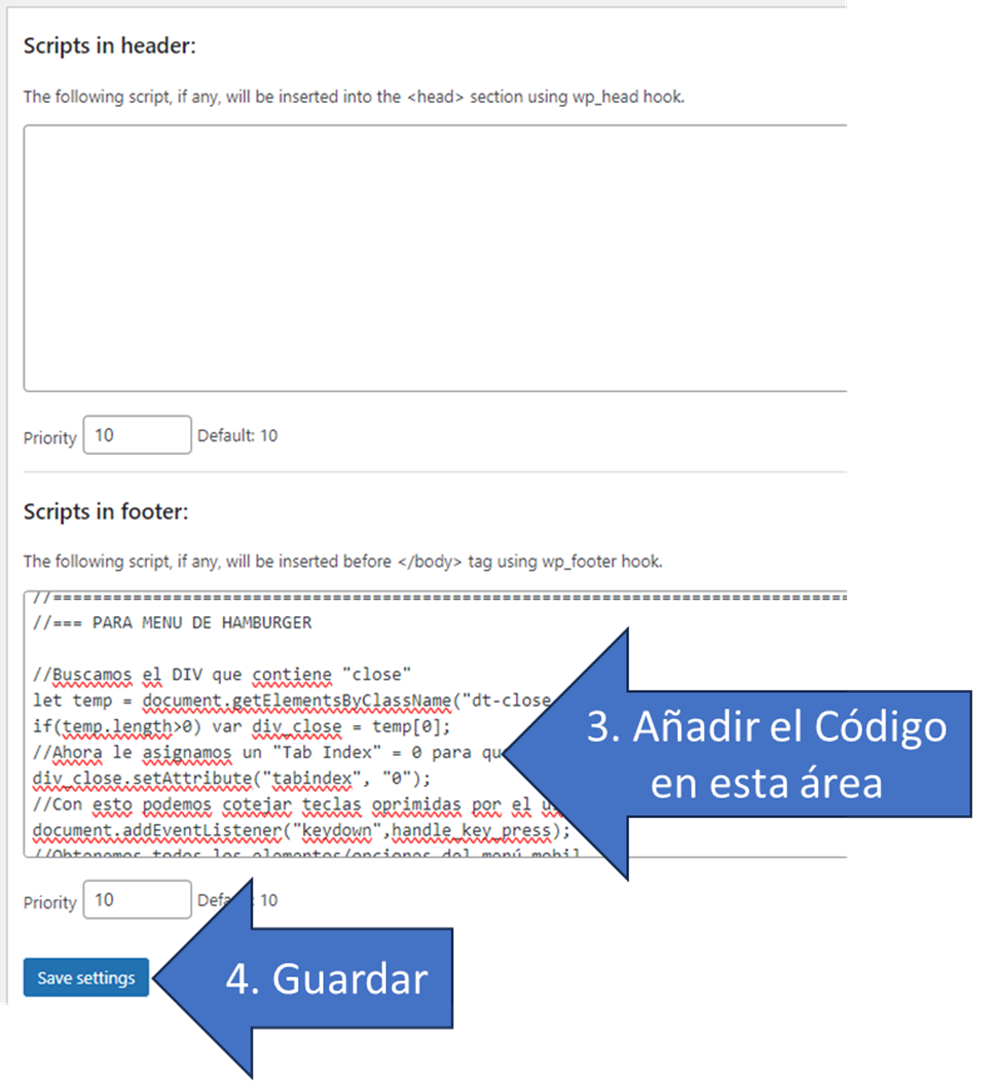
- Below is the JavaScript code to be inserted:
[code language=»javascript»]
//Para la página de Noticias y Eventos…
var noticias = document.querySelectorAll(‘a.rollover’);
if(noticias)
{
//Esto hace que las imagenes no sean accesibles (le elimino el foco)
noticias.forEach((n)=>{ n.setAttribute("aria-hidden", "true");
n.setAttribute("aria-disabled", "true");
n.setAttribute("tabindex", "-1");});
}
[/code]
Adding the CSS to fix the title focus:
-
- In the admin area of your page go to the top menu and look for “Theme Options” → “Advanced”

- Click on the “Tab” that says “Custom CSS” (arrow 3)

- In the space provided, add the following code (you can change the color #f28c20 to whatever suits you best, depending on your page): (arrow 4)
[code language=»css»]
/* TITULOS DE NOTICIAS */
h3.entry-title:focus-within { border: 3px solid #f28c20;} /* h3 con la clase "entry-title" tendrá el marco del foco*/
h3.entry-title:focus-within > a{ border: none;} /*Evita que el anchor <a> tenga marco a la misma vez que h3 */
[/code] - At the end, hit the “Save Options” button at the bottom bottom to save the changes (arrow 5)
- Go to your frontend page in your browser. I recommend that you open a new screen in "incognito" mode, so that "administrator" options (that black strip menu on your page) do not appear. Try using the "Tab" and see if the items in focus are "marked" correctly.
- In the admin area of your page go to the top menu and look for “Theme Options” → “Advanced”
